EcoSketch

Problem
Existing life-cycle assessment tools are difficult to learn and use. They also require precise data on material/ energy flows that is not available in early-stage design. Results obtained from the tools are often not easy to interpret for non-experts . As a result, the usage of LCA tools is often inhibited in early stage product design when key design and engineering decisions are made.
Overview
My role
Lead UI/UX Design Intern in a team of 3 designers and 4 developers
Overview
Solution
Design and build a novel LCA tool that is easy to use, accepts uncertainty in data input, and improves the user experience, enabling practitioners to evaluate environmental impacts of products early-on in the design process.
Scope
June 2020 - March 2021
Internship
Overview
Engineers use life-cycle assessment (LCA) tools to visualize and calculate the environmental impacts of products from cradle to grave, across life cycle stages, impact categories, and product parts. Ecosketch, a web-based LCA tool, offers improved concept comparison to help early-stage engineers and designers make informed decisions during product conception. This tool uniquely caters to early stage engineers with minimal technical knowledge in environmental engineering, by providing an easy to use and analyze interface. The tool also visualizes uncertainty of impact points to account for the early stage nature of these designs. EcoSketch will run on the Earth Shift Global API and will be a fully integrated product of the same company by the end of 2023; Ecosketch will go on to replace EarthSmart.
Outcome
A significant 113% reduction of time needed to complete an environmental assessment (from start to finish) compared to industry standard tools.
Our Partners
The development of the tool was conducted for EarthShift Global, a leader in LCA and sustainability-based consulting, software, and training, and in collaboration with Dartmouth Applied Learning and Innovation (DALI) Lab. We also partnered with Synapse Product Development Inc. and their parent company Cambridge Consultants, who provided us with product designers and engineers whose input guided our development of the tool. We conducted user interviews and focus groups, as well as co-creation sessions with users from both companies to verify designs and implement additional feedback.


Process
Researching the Problem & the User > First Prototype > Usability Testing > Second Prototype > Usability Testing (Co-creation Sessions) > Third Prototype > Usability Testing > Final Version
UX Research
User Research and Interviews
We first wanted to understand and define the problem. Accordingly:
I conducted user research to develop an understanding of an LCA tool’s workflow, the use of industry standard LCA tools, and criticisms of existing tools.
I conducted interviews and focus groups with our partners at Synapse and Cambridge Consultants who had experience with various LCA tools to understand their ideal LCA experience.
I explored prominent LCA tools in the market ranging from industry-standard options for LCA experts (GaBi and SimaPro) to lightweight options that target novice users (EarthSmart, Sustainable Minds, and Ecolizer) and analyzed the LCA tools based on users’ input and made note of all the positive and negative aspects of each one.
There was an immense variety in the ease of use, breadth of databases, reliability of results, speed of use, cost, and quality of data visualization and presentation of results. It was evident that users favored tools that had straightforward user flow, organized sections, a clear hierarchy of information, and a short learning curve. None of the tools, however, displayed uncertainty in data, which is an aspect that we knew our tool should include, as desired by our users.


After identifying the shortcomings of each tool, I formed How Might We Questions to address the needs of the users.
How might we design LCA software that is easy-to-use and accessible to novice users during early-stage product development?
How might our software improve the overall workflow of performing LCA in these situations to make sustainable product development decision-making more efficient?
How might we design better sustainability tools for industry practitioners moving forward?
It became evident that across existing tools on the market, there seems to be a trade-off between effectiveness and ease of use (primarily the learning curve). Tools that produce effective and easy to interpret results and data seem to be harder to learn and use. Existing tools struggle to provide outputs that are presentable as-is to clients.

HMW questions addressed
User Persona
Through our user interviews, we were also able to identify our main user persona as an engineer or designer who is a novice user of LCA software. They seek to use the tool to inform their decision-making.
Key user traits
Tech-savvy with some background in data analysis.
Have solid understanding of product manufacturing.
Pain points
Uncertainty at the initial phase of the design process.
Data input process is tedious and unpleasant.
Graphs and results are hard to convey to non-technical people.
Nature of their work
Some collaboration and pitching.
An iterative journey - needs information to proceed and refine.
Goals
Getting results fast to proceed with more informed design decisions.
Need quick presentable graphs and data to communicate progress.
Need a more friendly user experience by eliminating tediousness.


I then created an empathy map and a two user journey maps for our main user persona.


Main Insights
General
Negative bias towards LCA software. Therefore, our product should have a simple, clean, and intuitive UI
Need for big picture and fine detail views. Our product should create quick, easy access to both views
No agreement on units/labels preferences. Our product should have customizable options so users can choose units and labels.
Users plan on using this LCA entirely on a desktop/laptop and not on a mobile device.
Tool’s workflow and model-making
The data Input step is very tedious and time-consuming. We need to ideate on the tool workflow to make this step more efficient and less tedious.
Time pressure seems to drive the need for simpler tools. If project managers think that LCA work will require more than a few hours, they turn resistant to conducting the assessment.
Transparency to the sources of uncertainty is important to the user.
Visualization of the Tool
Charts/graphs produced by the tools are often not very helpful or descriptive.
Uncertainty visualization needs to be simple so that decision makers who lack the technical background can still fully understand and internalize uncertainty in data.
Designing the UI
First Prototype
After identifying the pain points of current tools and gathering insights about what the users need, I created prototypes for the workflow of the tool.
I first created some sketches, then a low fidelity prototype, and later a high-fidelity one.
I organized model-making so that, instead of keeping each life cycle stage as a separate page, stages are organized as tabs within one page to streamline the user interface. I decided to keep the phases as “Materials”, “Transport”, and “Use”.
I also designed the material/process data input as a pop, saving more space in the main pages for the life stages.

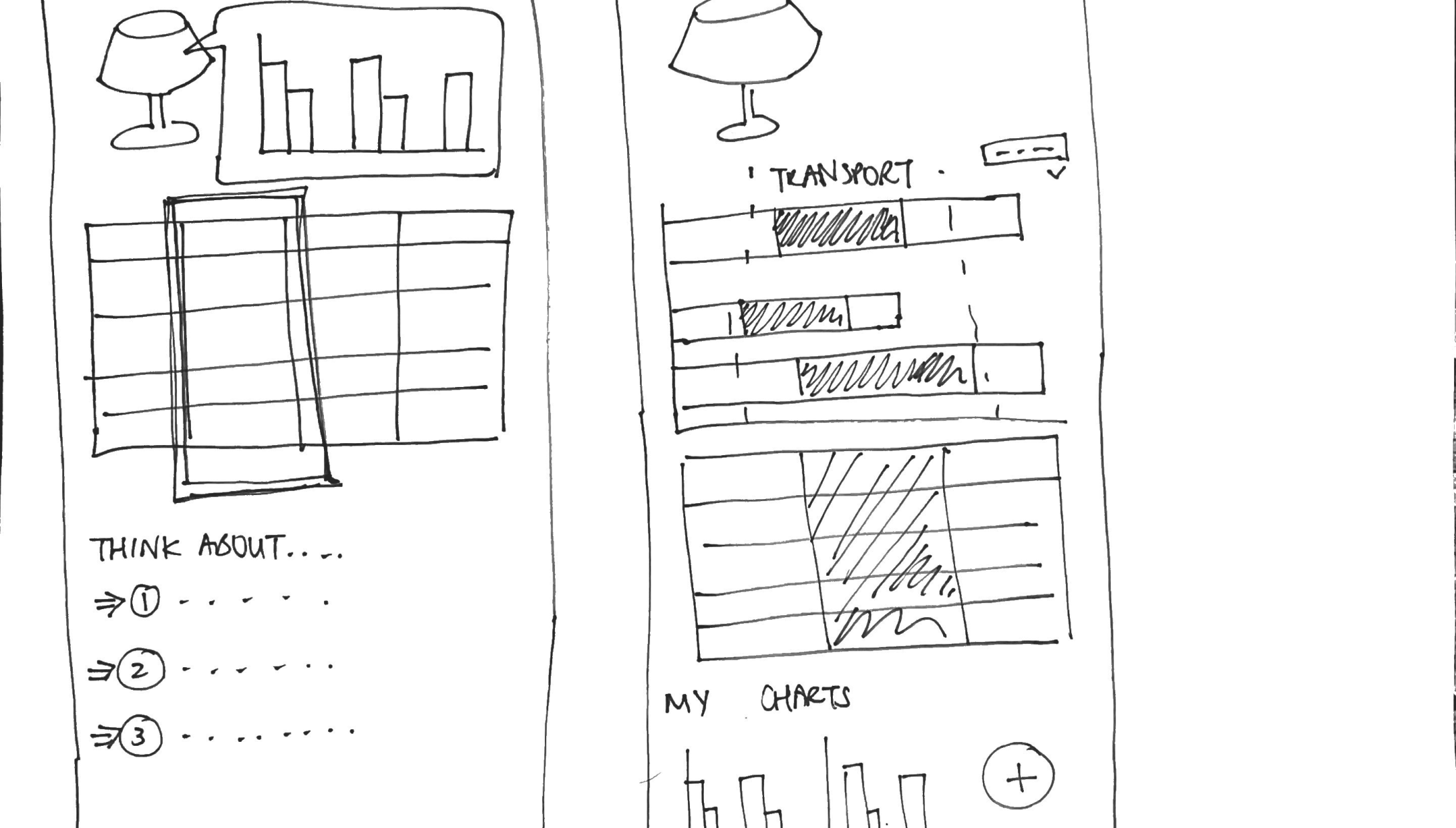
Sketches


Low-fidelity prototype


Home Page

Creating a Project : Basic Info

Model-Building

Material/Process Information

Visualization Page
We then tested our prototype with our users and found out that the prototype was a good starting point, but there was room for improvement.
Users liked having the life-stages as tabs. They thought it was more intuitive, and it streamlined the process.
Users also indicated preference for interactive and hoverable graphs to allow intuitive navigation through the various flows.
Users wanted some flexibility in customization, especially for the visualisation controls
Second Prototype
Working out the User Flow
For our second iteration of the tool, we explored different ways for the data to be grouped (for example by sub assembly, by life cycle stage, by impact, by uncertainty). After discussing this with the rest of the lab, we settled on 2 ways of grouping: by life cycle stage, and by impacts, in two separate flows.
We also had to redesign both the model making page and the visualization pages
I was responsible for making sketches of the new visualization page:

Working on the tool’s visualization
We first started thinking about different graph types and uncertainty visualizations. I looked into different uncertainty visualization methods and discussed it with our users.
Gradient or error bars forced people to acknowledge uncertainty the most
Error bars were the most familiar
The violin and box plots were confusing to “many users”. Neither conveyed the role of uncertainty
to users new to LCA

After it became clear that gradient and error bars seem the most intuitive approach,
I started making many grayscale iterations, in which I explored:
Graph Types
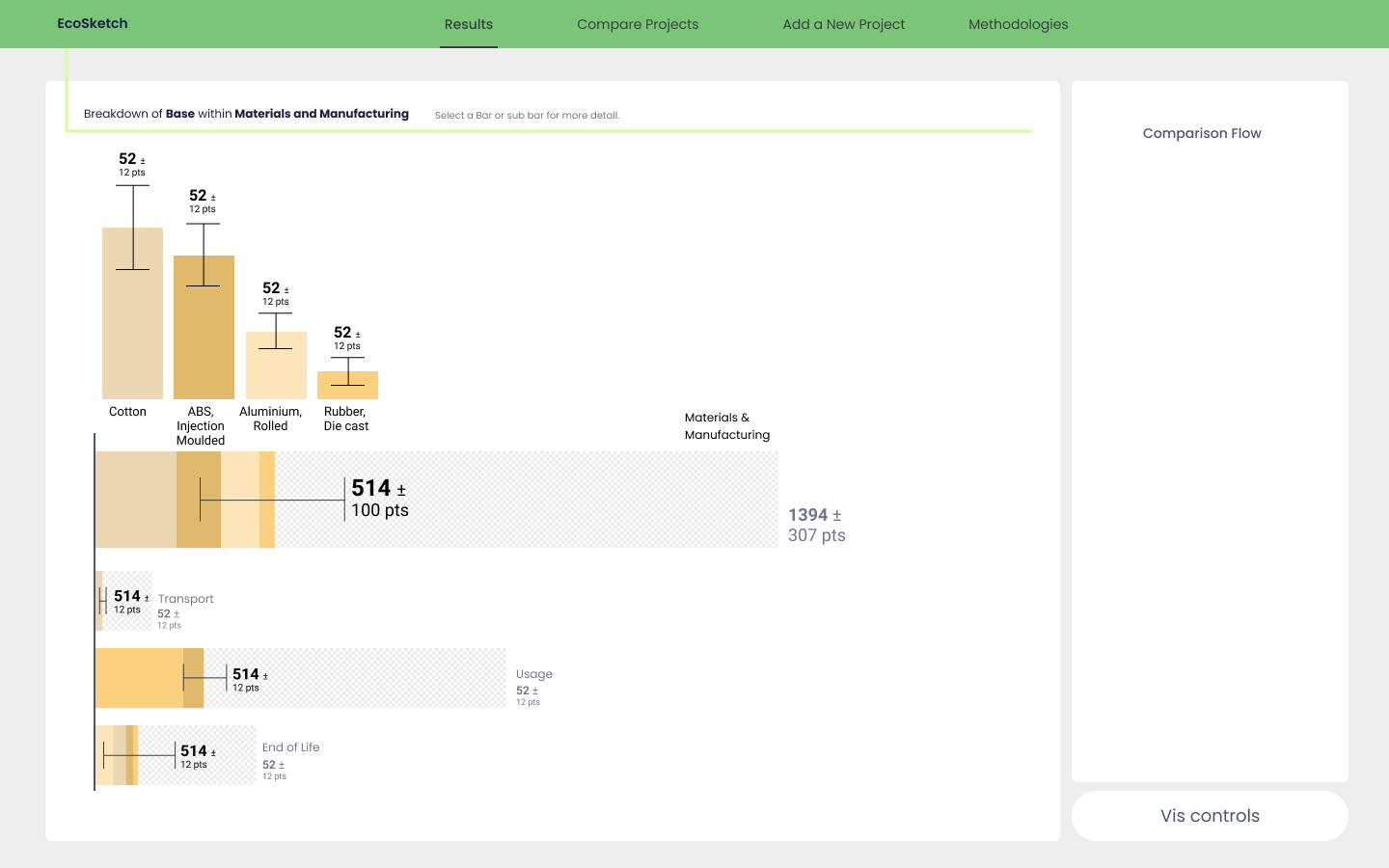
Including bubbles, cubes, and bars to show the size of impacts. We settled on bar charts as it was the most user supported.
Navigating the transition from high level to a fine detail view. We decided on bar charts that would expand into more bars for greater detail.
2. Uncertainty Visualization:
Including bubbles with halos, blurred bars, and error bars. We ultimately settled on error bars as users preferred distinct error boundaries given by error bars. It was harder for users to determine and grasp the exact environmental impact and uncertainty with the blurry gradient.
Low-fidelity prototypes of the different grayscale iterations I made:

Vertical error bars


Horizontal error bars


Blurred Bars


Bubbles with halos for uncertainty


Cubes with error bars for uncertainty

Co-Creation Session
After deciding on the uncertainty visualization and the general flow of the tool, we made our early high-fidelity designs and tested those with a focus group of engineers at Synapse.
In our early high-fidelity prototypes, I explored different ways to group our data: by life cycle stage, by impact, and by part.

Grouping by life cycle stages >

Upon clicking a life cycle stage

Upon clicking a part

Grouping by impact categories>

On hover

Upon clicking a part

Upon clicking a part
Upon clicking a life cycle stage

Grouping by parts/subparts>
The key takeaways from our focus group were that:
Grouping the data by life cycle stage and by impact was most important, and grouping by part was less useful.
The opportunity for data comparison in our designs was good, but more detail at the lowest level is desired.
We then used the feedback that we got from our users to create the high fidelity prototypes.
Colors
I was also responsible for choosing an appropriate color scheme for the website. I created different color iterations and ultimately ended up choosing the last version which is accessible to all, including color blind people. The color scheme is based on green and purple, which is one of the pairs of contrasting colors which maintain their contrast for everyone, including people who are colorblind.

Color iterations


Final color scheme

Style Guide (UI Kit)
High-fidelity Prototype
After analyzing and prioritizing the user feedback and deciding on the color scheme of the tool, we updated our high-fidelity prototypes.
The following are key pages in the final design:


This is a video of the final version. Feel free to look at the Figma Pages and play with the prototype too!
Third and Final Prototype
After finalizing the visualization page, for our third prototype, we revisited the model-building page and explored different ways of data inputting. We again interviewed our users to understand their needs.
We found that:
Users preferred an interactive input design that allows flexibility when selecting units and LCA method.
Users prefer nested organization of materials, methods, transport, etc. as well as assemblies and subassemblies.
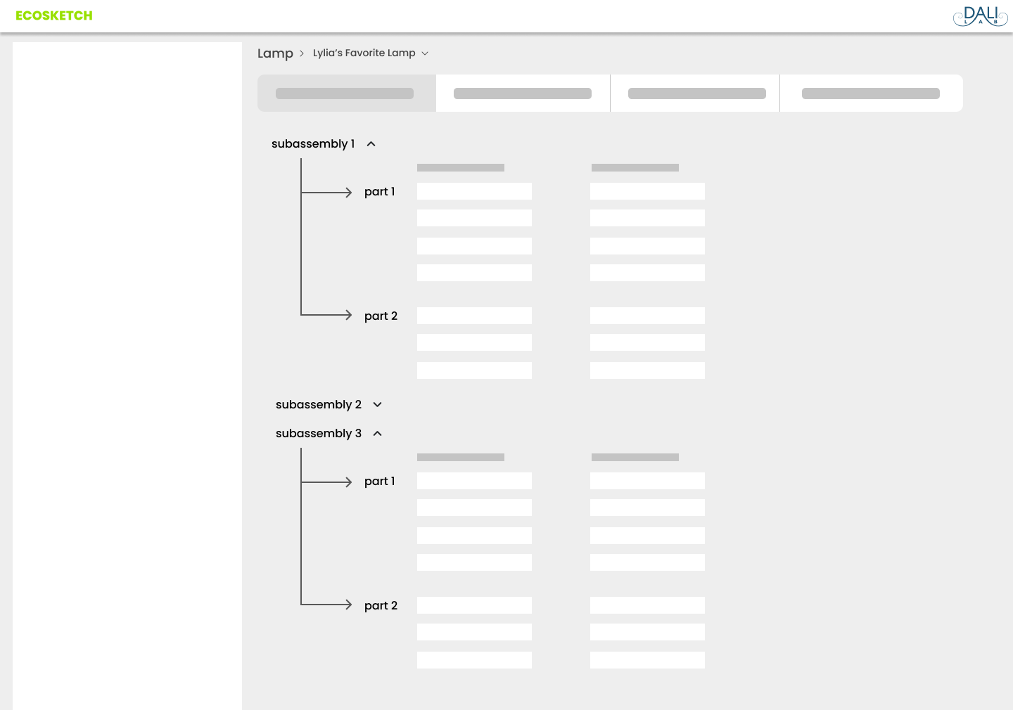
I first started by creating sketches of the sidebar, bill of materials (BOM), and the directory system. I then made grayscale prototypes of the sketches. Features that I prototyped:
Different page layouts that would allow interaction between users perusing through, inputting, and organizing their data. We ended up with a sidebar on the left with a model making space on the right.
Different ways to organize the database information such as cards split by category, dropdown menus, or sidebars (with horizontal expansion or vertical nesting). We settled on sidebar with vertical nesting as it was the most readable and efficient to develop.
For the B.O.M., we explored different formats that would allow users to best interact with their workspace, such as cards, vertical columns, and nested trees. We chose the nested trees as they were the best at showing the hierarchal relationships between parts.
We also spent a significant amount of time considering how users would move between the sidebar and the B.O.M and incorporated drag and drop.
Sketches and low-fidelity prototyped features:


Again, we tested our lo-fi page designs with our users. The engineers:
Reacted positively to the sidebar nesting.
Though that information should be nested in the BOM for ease of browsing.
Emphasized the importance of being able to link materials, processes, and life-cycle stages.
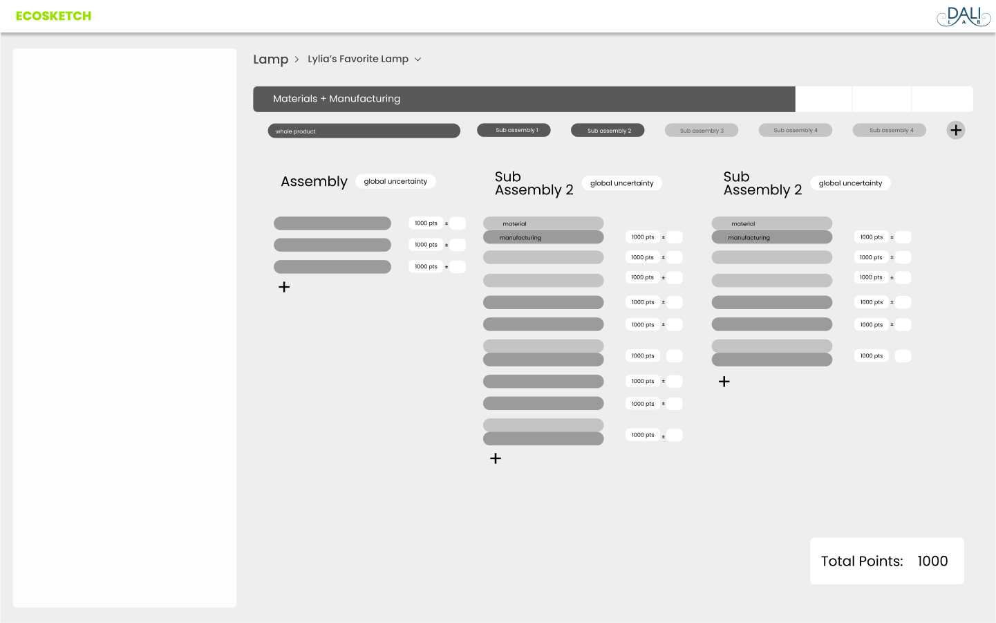
Reminded us that designers often do not have a precise idea of the uncertainty at the part level so early in the design process. We, therefore, have uncertainty at the sub assembly and assembly level, but not at the part level.
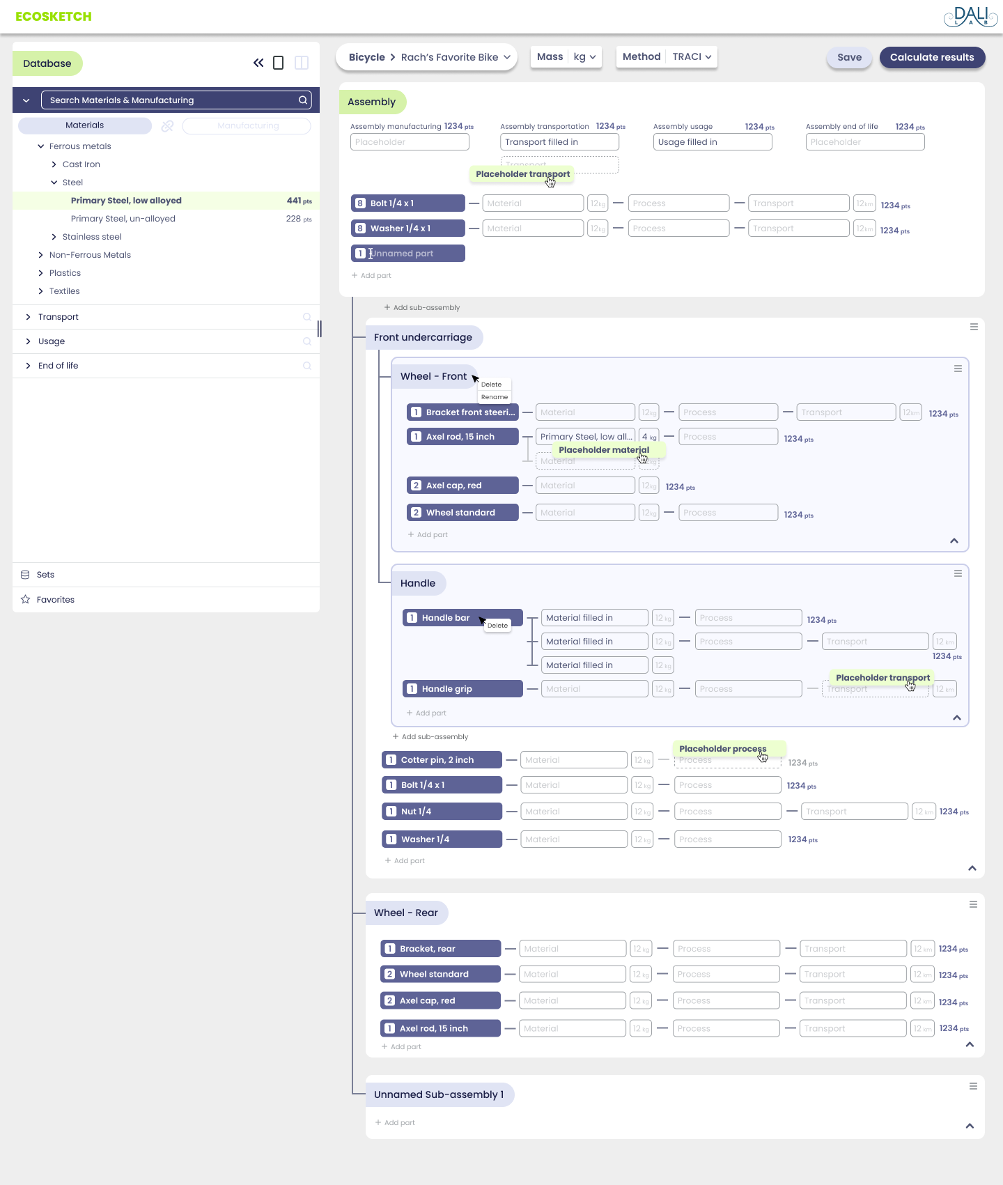
High-fidelity Prototype
After analyzing and prioritizing the user feedback, we updated our high-fidelity prototypes.
The following are key pages in final design:

Landing Page

Create a new project

Edit project details

Main Page (BOM)

This is a video of the final version. Feel free to look at the Figma Pages and play with the prototype!
Publications
During my internship with the Empower Lab, I also co-authored two published and peer reviewed publications; a paper and a journal article:
Reflection
Working within constraints can lead to creative outcomes. Faced with engineering, budget, and timeline constraints, we were forced to prioritize and scope our decisions. We threw together our rough ideas and iterated over and over until we came up with the best collective solution. Continuously receiving quick, rough feedback refined our design direction.
Involve engineers often and early. Collaborating with the engineering team was invaluable in understanding interactions and design handoffs.
Creating documentation that’s easy to understand. Working in a team of designers and developers that changes every 10 weeks meant that our design handoff had to be exhaustive and intelligible.
Next Steps
This is an ongoing project with challenges that will evolve throughout development, but I am excited to see EcoSketch launch in the coming year.